Printstore


Established in 1988 and based in Kingston-upon-Thames, we have been specialists in commercial printing for over 30 years. We provide a high quality service that exceeds the expectations of our clients, building long term relationships. Our goal is to maintain a good reputation in our field and to increase and invest in assets to support and develop our services. Our dedicated team can manage your project from start to finish.


PAGE SIZES

THE A SERIES

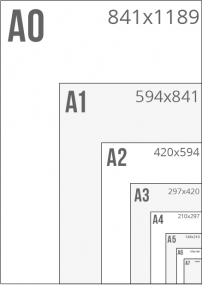
The A Series starts with the largest size, A0 (841 x 1189 mm). Each smaller size is obtained by taking the next largest size and cutting it in half, creating a size with the same proportions and half the area. Dimesions are listed below:

A0 841 x 1189 mm
A1 594 x 841 mm
A2 420 x 594 mm
A3 297 x 420 mm
A4 210 x 297 mm
A5 148 x 210 mm
A6 105 x 148 mm
A7 74 x 105 mm
THE B SERIES

B Paper sizes are over-sized printers sheet sizes which enable printing with bleed area, and to allow for printers marks for control and colour management. B Sizes are larger than the SRA sheet sizes which enable printing of bespoke sized jobs. This is also required for applying additional finishes and embellishments. 

B0 1000 x 1414
B1 707 x 1000
B2 500 x 707
B3 353 x 500
B4 250 x 353
B5 176 x 250
B6 125 x 176
B7 88 x 125

SRA SERIES

SRA Paper sizes are over-sized printers sheet sizes which enable printing most of the A Paper sizes with bleed area and allows for printers marks for control and colour management. This is also required for applying additional finishes and embellishments. 

SRA0 900 x 1280 mm
SRA1 640 x 900 mm
SRA2 450 x 640 mm
SRA3 320 x 450 mm
SRA4 225 x 320 mm

bespoke

Items can be produced at bespoke sizes to create a unique look and feel, or to fit within parameters of an existing product. Printing and designs can also be die cut to a particular shape or size to enhance and compliment a particular design. 

TYPOGRAPHY

Selecting the right type is essential in graphic design. Typography gives design its character and sets the tone of the message you are trying to communicate. Although the reader is generally unaware of it, every font evokes an emotional response. Serif, sans serif, script, modern and original typefaces all carry meaning. For editorial typesetting, typefaces selected must be engaging and easy to read otherwise you will lose the reader.

SERIFS

Serifs are the small lines attached to letters. Their origins are a mystery; one theory suggests they arose when scribes using brushes or quills left small marks with the writing implement as they finished each stroke. This evolved into deliberately adding smaller strokes in more regular, artful ways, and those decorative strokes became an expected part of the letters. Serif fonts can look authoritative, professional, and are suggestive of experience. Serif typefaces are still used by The Times and other institutions around the world.

SANS SERIF

Sans serif typefaces were controversial when they first appeared and were sometimes called “grotesque” typefaces. But when modernist designers like the Bauhaus movement embraced sans serif typefaces, they became associated with cutting-edge design, commerce, and modernism. Futura became one of the first popular sans serif fonts, others like Helvetica soon followed. Sans serif fonts work well where there’s very little room for copy. They also work well for short sections of text, For small type sizes, sans serif type is much easier to read.

TYPOGRAPHIC TERMS

COLOUR MANAGEMENT

Selecting the right type is essential in graphic design. Typography gives design its character and sets the tone of the message you are trying to communicate. Although the reader is generally unaware of it, every font evokes an emotional response. Serif, sans serif, script, modern and original typefaces all carry meaning. For editorial typesetting, the typefaces selected must be engaging and easy to read otherwise you will lose the reader.

CMYK

Serifs are the small lines attached to letters. Their origins are a mystery; one theory suggests they arose when scribes using brushes or quills left small marks with the writing implement as they finished each stroke. This evolved into deliberately adding smaller strokes in more regular, artful ways, and those decorative strokes became

pantone

Serifs are the small lines attached to letters. Their origins are a mystery; one theory suggests they arose when scribes using brushes or quills left small marks with the writing implement as they finished each stroke. This evolved into deliberately adding smaller strokes in more regular, artful ways, and those decorative strokes became

greyscale

Serifs are the small lines attached to letters. Their origins are a mystery; one theory suggests they arose when scribes using brushes or quills left small marks with the writing implement as they finished each stroke. This evolved into deliberately adding smaller strokes in more regular, artful ways, and those decorative strokes became

RGB

Serifs are the small lines attached to letters. Their origins are a mystery; one theory suggests they arose when scribes using brushes or quills left small marks with the writing implement as they finished each stroke. This evolved into deliberately adding smaller strokes in more regular, artful ways, and those decorative strokes became